Current Law Firm Website Trends

In the fast-paced, always-live world of 2021, your website is essential. In fact, it should be akin to your best, most loyal, always-on-brand, 24/7 employee. It’s an advocate for you and your law firm and an always-accessible hub of information for your current and prospective clients.
The best part is you have total control over your website. You decide what information is on it, you shape the prospective client journey and how your website users can interact with your site. You have total control of the thing that will give most of your prospective clients their first impressions of your law firm.
At this point, you probably know all this. The more pressing question you may have is “how do I create such a website?” The first step to creating a website that does its job is developing a strategy around it, which means understanding what should go into a website as it pertains to your industry and goals.
In this blog, we are going to walk you through current law firm website trends, so you have a good idea of what you need before you search for marketing companies in West Palm Beach to help you with design or redesign.
Trend 1: It Doesn’t Party Like It’s 1999
In 2021, your website shouldn’t look “pre-dot-com-bubble-burst.” The online world is ever-changing, and website design conventions change with it. Having a website that isn’t updated or responsive destroys your trust and legitimacy online. You can have the most sophisticated PPC campaigns, magnificent public relations and strong search engine optimization , but if these marketing efforts lead back to a dinosaur of a website, you’re wasting money. Here are some design practices that have drastically shifted over the last decade and could be why your website looks old:
1. Flat design
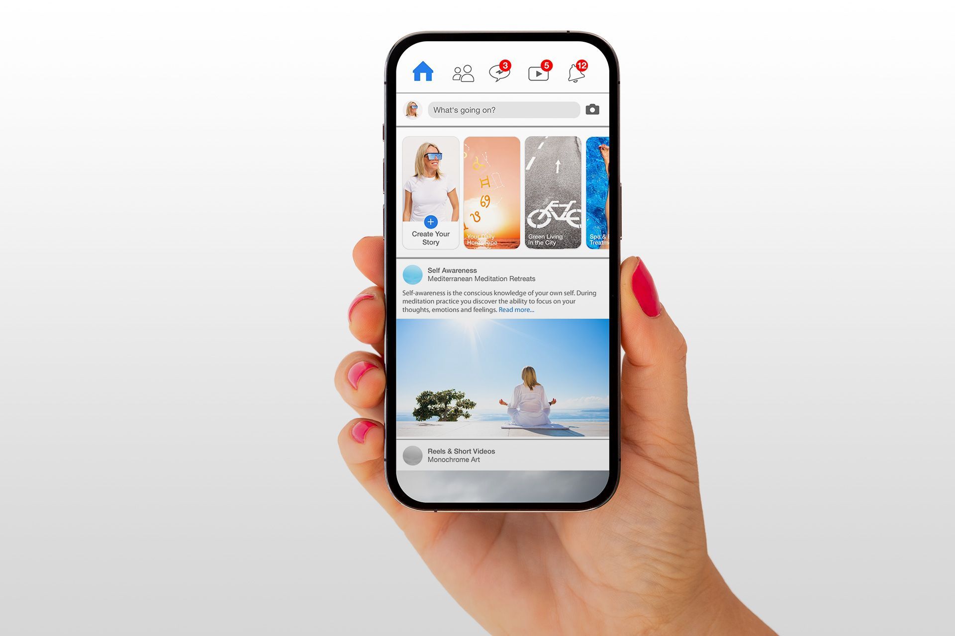
– It was one of the biggest design trends of the last decade to make digital apps and assets clean and accessible. As an example, look at your smartphone. The way the apps reflect a flat, consistent layout, flat colors and geometric san-serif fonts reflects what flat design looks like.
2. Mobile responsiveness
– In 2011, mobile phone website traffic share was about 6 percent. In 2021, that number is about 56 percent. Having a mobile-responsive website is a big deal.
3. Movement
– In the last decade, website design has become more interactive. Websites don’t just have words and still images anymore. Websites incorporate videos, gifs and other moving elements that invite consumers into the brand and increase intra-website navigation.
Does your website have any of the elements that became popular in the last decade? If not, you may be in need of a website redesign.
Trend 2: High Functionality That Puts the Client First
Functionality refers to the flow of your website and the process a client must go through to navigate through it. Your functionality should be user-friendly, meaning the navigation flow is easy and follows current conventions that Internet users expect. Marketing companies in West Palm Beach should put simplifying functionality at the top of their website design priorities in the development process. This is done by implementing the following items:
1. Easy menu navigation
– It’s a well-known convention to place your menu navigation at the top of the website. Navigation should be easy to follow and read, and it should link where it says it does; for example, the “about” page should go to content that tells a story about you and/or your law firm.
2. Mobile responsiveness
– This comes up in all aspects of a website development because it’s so important. For functionality sake, make sure clickable images and buttons are actually clickable for mobile users and don’t use “hamburger menus” (the stacked lines you see on mobile websites that access the navigation menu) on the desktop version of your website.
3. Search function
– You want users to find what they’re looking for on your website. Including a search feature within your site is a good idea. This allows users to search for keywords within your site to find the content they need. A great way to implement a search option and create a client-first experience is to incorporate a chatbot on your website
.
A good sign that your website isn’t user-friendly may be a high bounce rate. This is a metric that measures the percentage of visitors to a particular website who navigate away from the site after viewing only one page.
Trend 3: Your Website is Accessible to All
Over the last few years, emphasis has been on building accessible websites, which ensures users with disabilities can engage with the content and features on your website easily. There are several tools out there to help you ensure your law firm website is accessible, but here are a few things you’ll want to look at to maintain an accessible website:
1. Use alt text on your images
– Alt text allows screen readers to describe an image to people who may not be able to clearly see it. Updating all of your alt text also helps to increase search engine visibility.
2. Implement captions for all videos
– Ensuring your videos have captions allows people who may have hearing impairments to engage with the content.
3. Identify the language of your website
– Some screen readers are multilingual. Identifying the default language of your site can enhance accessibility.
These tips are just the beginning. As stated, there are many tools to ensure website accessibility today, and your web development partner should know the best practices to create a website experience that supports anyone and everyone.
Trend 4: Emphasis on Content Marketing
Content is still one of the most important elements of your website in 2021. Creating a good content strategy means first understanding the content your prospective clients want to consume, crafting your brand messaging and identifying your content types. Whether you produce video, podcasts, blogs, case studies, ebooks, infographic, webinars, whitepapers or all of the above, make sure your content speaks to your audience. A good way to do this is by understanding how to leverage each piece of content for specific phases of your marketing funnel.
For instance, a case study can help highlight your past client and case successes that may convince someone in the final stages of your funnel to hire you. An infographic may be good in the beginning phases for prospective clients trying to learn more about their legal options after an incident. Here are some content marketing tips that will put your website ahead of your competition:
1. Have a blog schedule
– Not only does a regular blog help search engine visibility (help your prospects to find you online), it also helps educate your clients once they do find you.
2. Create videos from your blogs
– Your would-be clients being able to see your face and mannerisms begins to create an element of trust from the very beginning. Video is also a great way to capitalize on short attention spans.
3. Highlight past results
– How often have you received this question from your clients? Go ahead and answer questions about your past success online via case studies that will help convince prospects you’re the right attorney for their case.
4. Hire a team to help
– Content marketing is a fulltime job, and you already have one of those. Hiring a marketing company in West Palm Beach will help you keep up with your content and stand out from the crowd.
Contact Oamii Today for a Marketing Plan That Works
Having a compelling website and a strategy around it is a powerful thing. If done correctly, you’ll end up with a lead funnel (or multiple lead funnels) that brings qualified clients your way. Doing this alone is nearly impossible and searching endlessly for marketing companies in West Palm Beach can be tiresome. Hire Oamii today to help you develop a website and marketing plan that generates actual results. Please fill out our online contact form or call us today.
Disclaimer: The information on this website and blog is for general informational purposes only and is not professional advice. We make no guarantees of accuracy or completeness. We disclaim all liability for errors, omissions, or reliance on this content. Always consult a qualified professional for specific guidance.


